You’ve visited all the tile shops in town, checked out hundreds of online blogs and have finally chosen the perfect tiles for your home. You’re well aware that a lovely tile floor can turn even the most ordinary spaces into a work of art. But, wait! It’s not just the tile design, colours and materials that you choose—how you lay out the tiles is also equally important!
No idea where to start? To help you get your flooring layout together, we’ve rounded up some of the coolest tile patterns used in home interiors. These tile ideas are guaranteed to make your floors the talk of the town!
#1. Herringbone
Named after the bone structure of a Herring fish, the Herringbone pattern has a column of rectangular tiles laid at 45 degrees to each other, with a mirror of the same column right alongside. The joins of the two columns come together in a lovely ‘V’ pattern. The Herringbone style is popularly used on tile backsplashes and wooden floors, and can be used with a contrasting grout to highlight the angles.

#2. Chevron
Chevron stripes are bold and stylish, and are an edgy offshoot of the Herringbone pattern. Here, the shorter edge of the tiles is truncated to form a mitered 45 degree joint. Each tile is not a rectangle, therefore, but a rhombus with two sides at 45 degrees and 135 degrees to the other two. This pattern is more commonly used for wooden floor tiles, which are designed to suit the pattern. Cutting the edges of a rectangular tile can be very hard and will not give the perfect finish you are seeking.

Check out the image below that illustrates the difference between a Herringbone pattern and the Chevron stripe. Both patterns are dynamic, with an arrow-like effect; but the herringbone style can be created using rectangular tiles, while the chevron style calls for tiles that are styled to a rhombus shape.

#3. Stretcher Bond in Brick
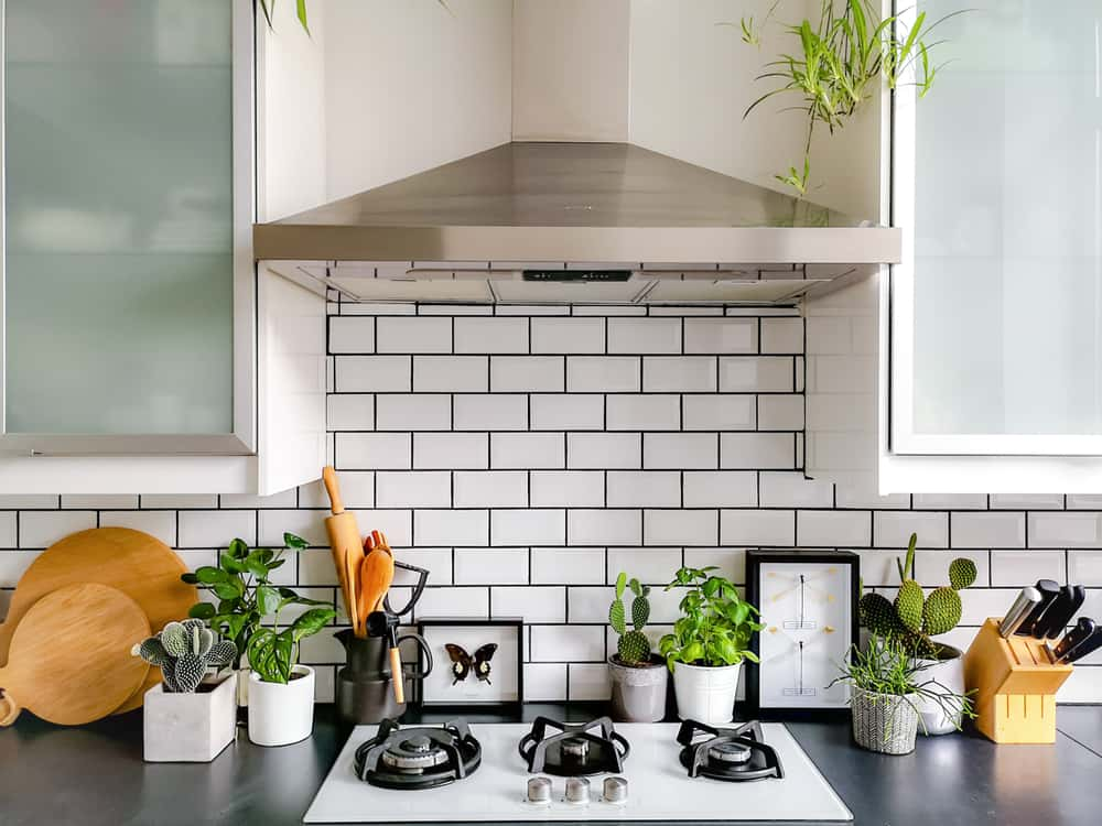
One of the most common brick laying patterns, stretcher bond (also called Running Bond) has the joins in each course centred on half a brick in the next course, with alternate courses being aligned the same way. Subway tile is often laid in this pattern, and makes for a simple and neat aesthetic.

#4. Horizontal Stacking
In this pattern, rectangular subway tiles are set in a straight horizontal line with rows and columns all lined up, making for a very look that’s simple and clean. Horizontal stacking will add visual breadth to a space, while vertical stacking (with the tiles the other way around) will add the perception of height.

#5. French Pattern
Commonly associated with natural stone or terracotta, the French pattern of tile-laying involves a combination of small and large squares and rectangles to create a repetitive pattern that reads a bit like a jigsaw puzzle. This pattern looks lovely when laid with spacers and tile grout in a contrasting colour.

#6. Straight Lay Pattern
The straight Lay pattern is plain vanilla, with square tiles neatly aligned in a grid—the most common and simplest way to lay tiles. You can mix and match plain and patterned tiles in a straight grid pattern, to create a carpet effect on your floor.

#7. Diagonal Pattern
The Diagonal pattern (also called the Diamond pattern) is a variant of the Straight Lay grid, and places square tiles in the same grid, but at 45 degrees to the walls. This helps to create visual interest when you’re using coordinated square tiles, and also has the effect of making the room appear both wider and longer.

#8. Pinwheel Pattern
A Pinwheel pattern (also called Hopscotch pattern) uses a small square tile, usually in a darker colour, at each corner of a larger square tile, staggered to create the effect of a spinning pinwheel. This is a great way to introduce an accent colour into your flooring. It’s also a popular option to use when the walls are not at perfect right angles, as any wall alignment errors will not be easy to discern.

#9. Squares with Inset Diamonds
Another variant of the straight grid, this pattern uses tiny squares in a contrasting colour laid at all the corners of the main grid, in the form of a diamond. A lovely way to create subtle contrast when using plain black and white tiles!

#10. Basket Weave
No prizes for guessing where the name of this pattern is derived from—this layout resembles the characteristic weave of a wickerwork basket! An interlocking grid of rectangular tiles, laid at a 45 degree angle and with a square in between, this pattern is reminiscent of the over-under stitch of a woven basket. It looks best when laid using light-coloured plain tiles; if you use patterned tiles the whole effect might just be too busy.

#11. Hexagonal Pattern
Here, the tiles are geometric hexagon shapes, and are fitted together evenly to form a mosaic effect. This pattern works well if you use two-tone tiles, and weave a coloured pattern into the layout.

#12. Carpet Effect
This custom-created layout uses a combination of Straight Lay square tiles all around the edge of the room, with Diagonal square tiles laid as a central carpet. A border of vertical and horizontal stacked rectangular tiles all around the carpet demarcate one pattern from the other.

#13. Broken Tiles Mosaic
A very unique to use leftover broken tiles, this tile layout uses different coloured solid tiles to create a circular, symmetric mosaic pattern. It’s a great way to save broken tiles from the landfill, while getting hands-on and creative at the same time!

Looking to make a stunning decor statement on your floors? The tile wizards at HomeLane are ready to give a helping hand!


